
30 Beautiful Living Room Color Schemes
Discover 30 beautiful living room color schemes, from cozy neutrals to bold blues and greens, with easy tips to pick the right palette for your space.
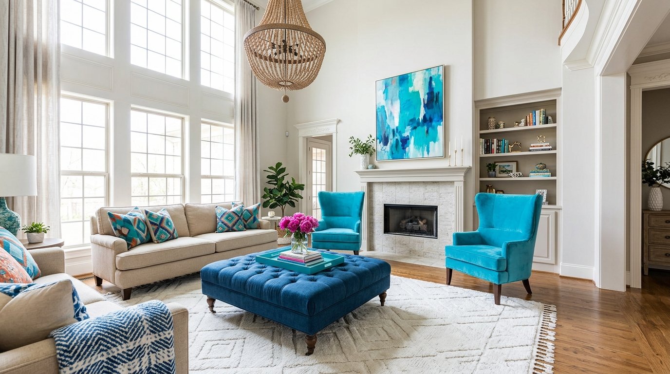
Picking a paint color is easy. Picking a palette that still feels right after the sofa, rug, and curtains arrive is the hard part. The best living room color schemes work as a team: a main color for the walls, a supporting shade for furniture, and a small dose of accent color that keeps things lively. Get that balance right and the whole room feels calm, finished, and welcoming.
This guide walks you through 30 living room color schemes, grouped into six styles from soft neutrals to bold statement palettes. Each combination comes with a quick note on how to use it, so you can borrow the exact mix or adapt it to your own space.
How to Choose the Best Living Room Color Schemes
Before you fall for a palette, look at what your room already has. A color that looks perfect in a photo can feel completely different once it meets your flooring, your windows, and the light in your home. A few minutes of planning here saves a lot of repainting later.
Consider Your Furniture, Flooring, and Natural Light
Start with the pieces you are keeping. A gray sofa, an oak floor, or a patterned rug already carries an undertone, either warm or cool, and your walls should agree with it. Hold paint samples next to those items rather than judging them on a blank wall.
Natural light matters just as much. North facing rooms tend to look cooler and flatter, so warm whites, sand, and soft greens help them feel brighter. South facing rooms get warm, golden light all day, which means they can handle deeper blues and cooler grays without feeling heavy. Check your samples in the morning, at midday, and in the evening before you commit.
For more inspiration on how designers think about palettes, the team at Homes & Gardens shares a full set of living room color ideas worth browsing. If you want to see how colors pair up across a whole home, this guide to color combinations and home palettes is a handy companion.
Balance Neutral Colors With Accent Shades
A reliable formula is the 60-30-10 rule. Use about 60 percent of a dominant color (usually the walls), 30 percent of a secondary color (the sofa, curtains, or a large rug), and 10 percent of an accent (pillows, art, a throw, or a vase). It keeps the room cohesive without feeling flat.
Neutrals do the heavy lifting in this setup, while accents add personality. If you love change, keep your big pieces neutral and swap the accent shades with the seasons. It is the cheapest way to refresh a room.
Neutral Living Room Color Schemes
Neutral palettes are the safest place to start, and they never feel boring when you layer in texture. Think linen, wool, rattan, and wood grain. These five combinations give you calm, timeless rooms that work with almost any style of furniture.
Cream, Beige, and Natural Wood
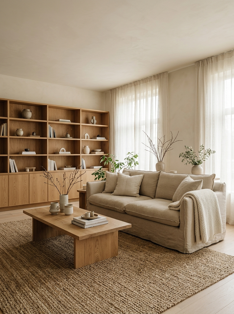
This is the classic cozy mix. Paint the walls a soft cream, choose a beige sofa, and bring in oak or walnut for the coffee table and shelving. The warm tones blend into one another, so the room feels relaxed and uncluttered. Add a jute rug and a chunky knit throw for texture.
Greige, White, and Warm Brown
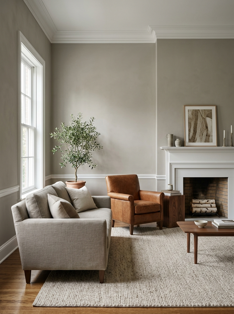
Greige sits between gray and beige, which makes it perfect when you cannot decide between warm and cool. Pair greige walls with crisp white trim and a warm brown leather chair or wood side table. The brown grounds the palette, while the white keeps the room bright and fresh.
Taupe, Ivory, and Charcoal
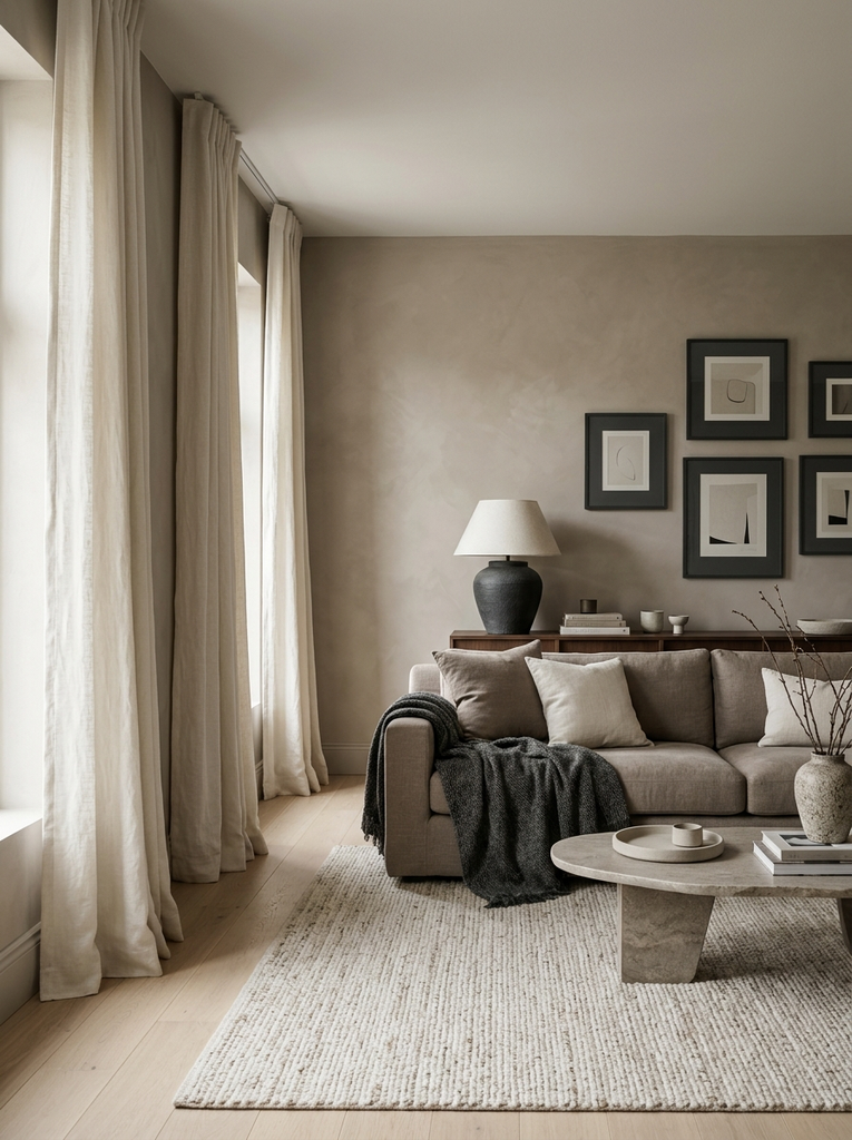
Taupe has a quiet sophistication that works well in formal or modern rooms. Combine taupe walls with ivory curtains and charcoal accents, such as a throw blanket, a lamp base, or picture frames. The charcoal adds definition so the soft tones do not blur together.
Warm White, Sand, and Soft Gray
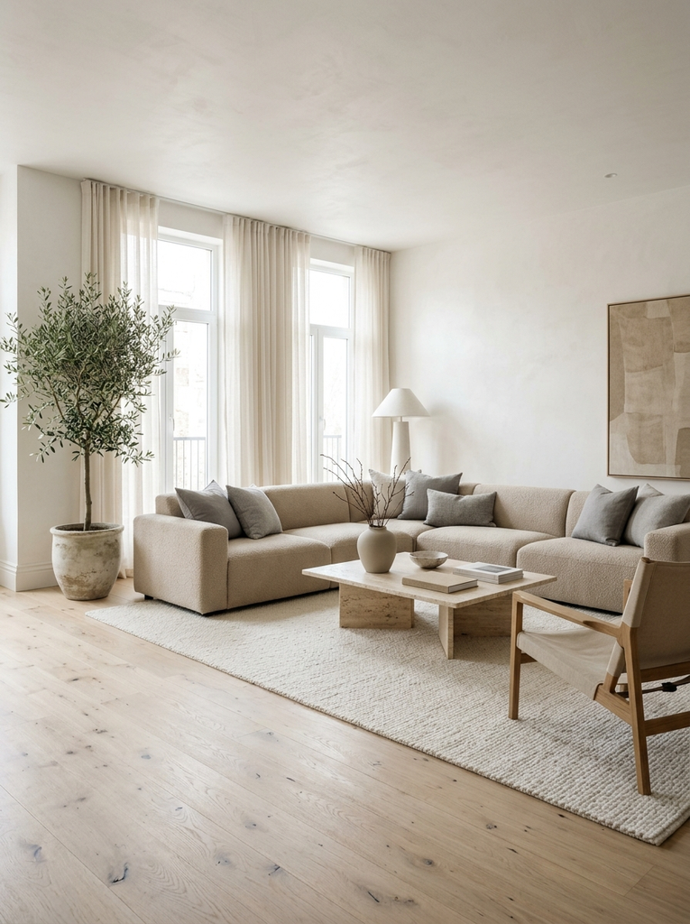
If you want a light, airy living room, this trio delivers. Warm white walls reflect plenty of light, sand colored upholstery adds a gentle glow, and soft gray cushions cool things down just enough. It is an especially good choice for smaller rooms that need to feel more open.
Oatmeal, Cream, and Dusty Blue
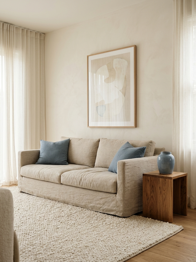
Oatmeal and cream create a soft, textured base, and a touch of dusty blue brings in quiet color. Try dusty blue in a pair of pillows, a vase, or a framed print. The result is peaceful and a little bit coastal without being themed.
Green Living Room Color Schemes
Green connects a room to the outdoors, and it pairs well with both warm and cool materials. From gentle sage to deep emerald, there is a green for every mood. These palettes work especially well if you have houseplants, because the leaves will blend right in.
Sage Green, Cream, and Oak
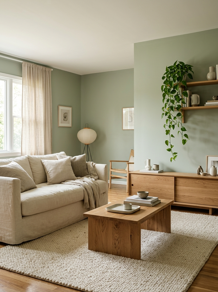
Sage is a soft, gray toned green that feels restful and modern. Use it on the walls or on a statement sofa, then add cream textiles and oak furniture. The combination is gentle on the eyes and ideal for a relaxing family room.
Olive Green, Blush Pink, and Ivory
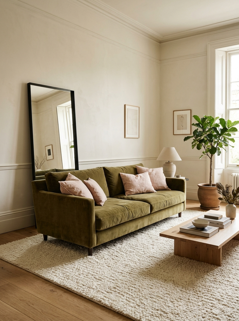
Olive and blush are a surprisingly lovely pair. The earthy green keeps the pink from feeling too sweet, and ivory ties the two together. Try an olive velvet sofa with blush pillows and an ivory rug for a look that feels both fresh and slightly vintage.
Emerald Green, Beige, and Brass
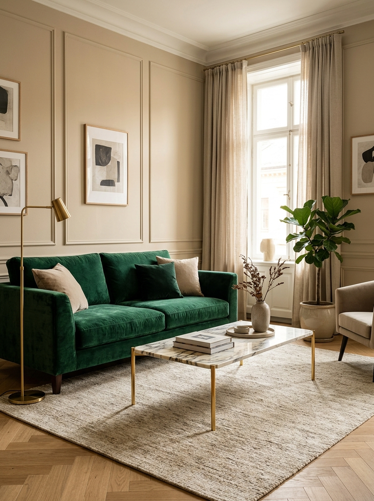
For a more glamorous living room, emerald is hard to beat. Balance its richness with warm beige walls and add brass lamps, frames, or a coffee table with metal legs. The metallic glow makes the deep green feel luxurious without being overpowering.
Forest Green, Warm White, and Walnut
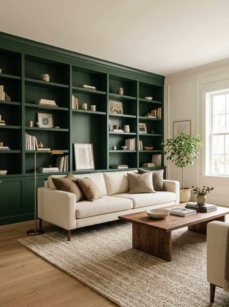
Forest green is deep, grounded, and a little moody. Use it on an accent wall or built in shelving, and keep the remaining walls warm white so the room does not feel dark. Walnut furniture adds richness and finishes the look beautifully.
Moss Green, Terracotta, and Linen
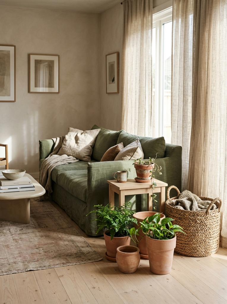
Moss green and terracotta sit side by side in nature, so they feel instantly natural together. Add linen curtains and a woven basket or two to soften the palette. This is a wonderful pick for a cozy, earthy living room with lots of handmade character.
Blue Living Room Color Schemes
Blue is one of the most popular choices for living rooms because it reads as calm and trustworthy. Light blues feel airy, while deep blues feel cozy and dramatic. If you love a breezy look, our coastal living room ideas show more ways to bring blue into your home.
Navy Blue, Taupe, and Cream
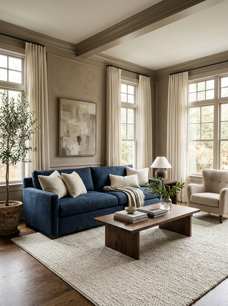
Navy is a timeless anchor color. Use it on the sofa or an accent wall, then soften it with taupe walls and cream cushions. The mix feels polished and traditional, yet it is easy to update with modern accessories.
Dusty Blue, White, and Natural Oak
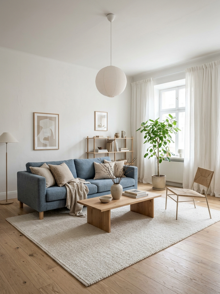
Dusty blue has a soft gray undertone that keeps it relaxed rather than bright. Pair it with white walls and natural oak furniture for a clean, Scandinavian inspired living room. It is a lovely choice for spaces with lots of daylight.
Powder Blue, Lavender, and Warm White
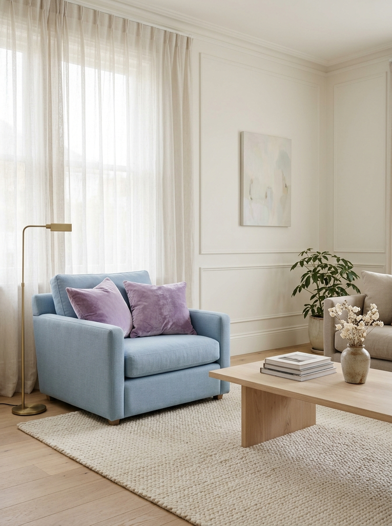
This is a gentle, dreamy palette for people who love pastels. Powder blue and lavender sit close together on the color wheel, so they blend smoothly. Warm white keeps the whole scheme from turning icy, and a few velvet pillows add depth.
Teal, Sand, and Cognac Brown
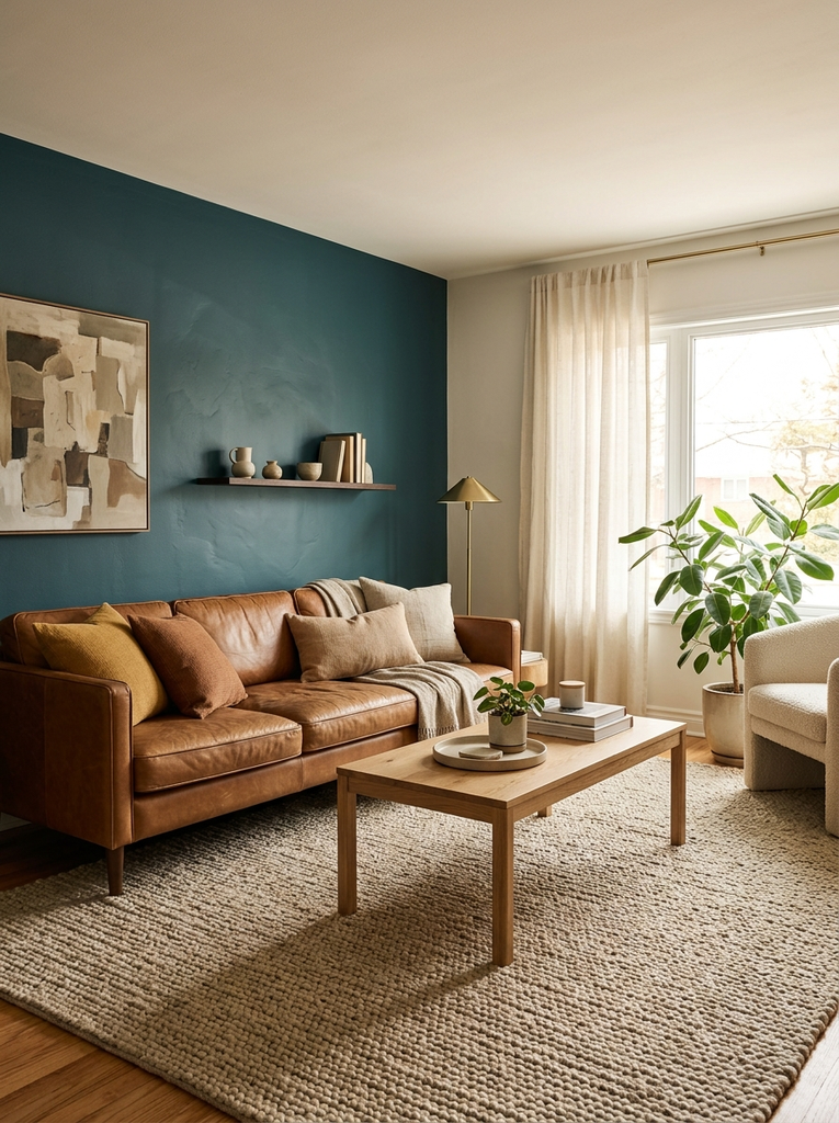
Teal brings energy, sand keeps it grounded, and cognac leather adds a rich, warm contrast. Picture a teal accent wall behind a tan leather sofa with sandy neutral rugs. It is bold, but the warm tones keep it welcoming.
Indigo, Rust, and Ivory

Indigo and rust are near opposites on the color wheel, which is why they look so striking together. Ivory walls give both colors room to breathe. Add a kilim rug or a patterned throw to bring the palette together.
Warm and Earthy Living Room Color Schemes
Warm palettes make a living room feel like a hug. They rely on colors found in clay, wood, spice, and autumn leaves. If this style speaks to you, take a look at our guide to earthy living room ideas for even more layouts and styling tips.
Terracotta, Beige, and Walnut
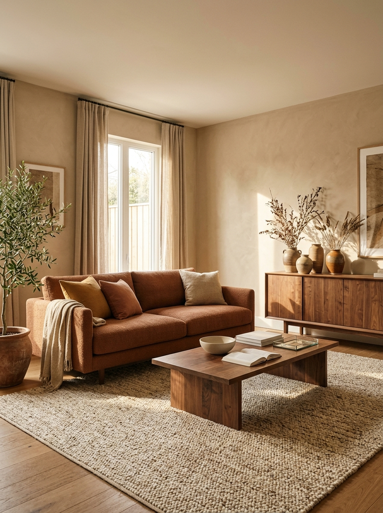
Terracotta is rich and sun baked, and beige keeps it from becoming too intense. Add walnut furniture and a few ceramic vases for a look that feels warm and a little Mediterranean.
Burnt Orange, Olive Green, and Cream
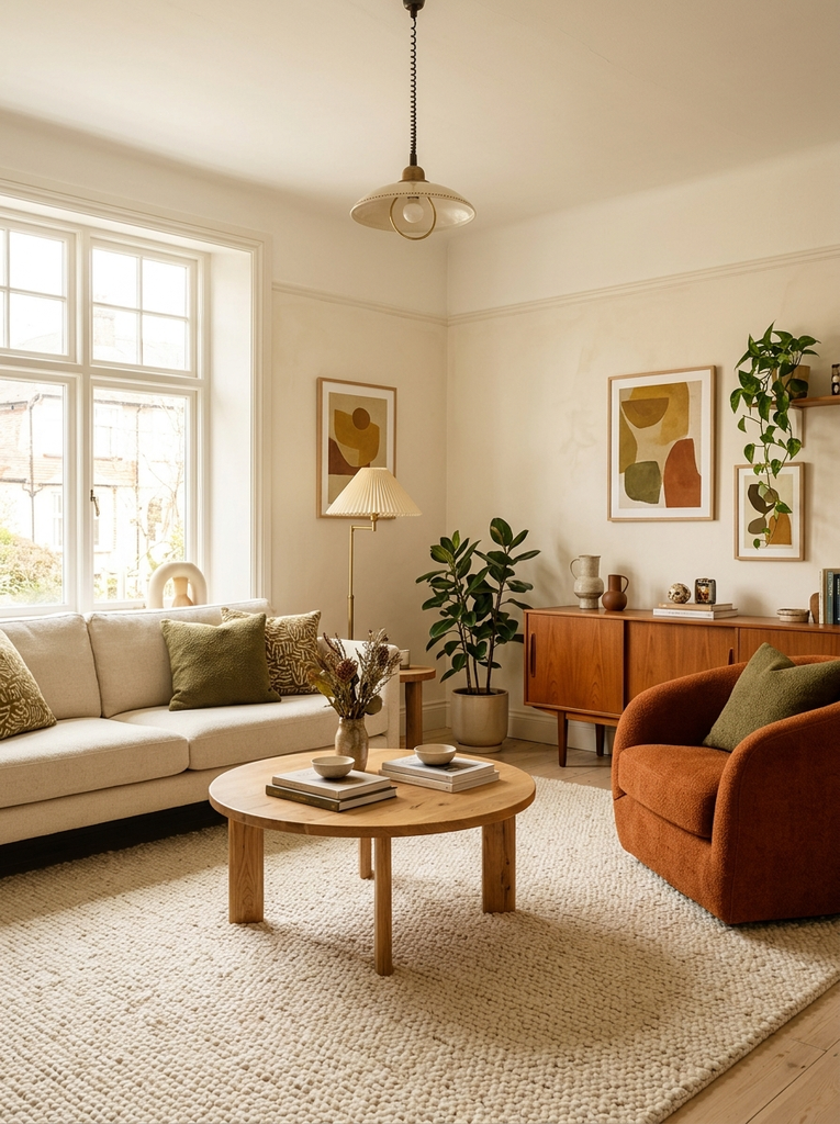
Burnt orange and olive are a retro favorite that feels fresh again. Use cream as the base and bring in the two colors through pillows, a rug, or an armchair. Keep the orange to small touches so it does not dominate.
Chocolate Brown, Ivory, and Muted Green
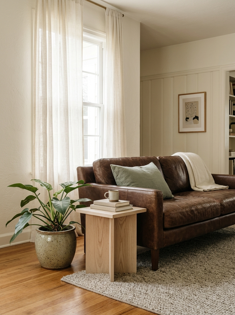
Chocolate brown is deep and comforting, especially on a leather sofa. Ivory walls keep the room light, and a muted green plant or pillow brings in life. This palette feels grown up and reliably cozy.
Mustard Yellow, Warm Gray, and Linen
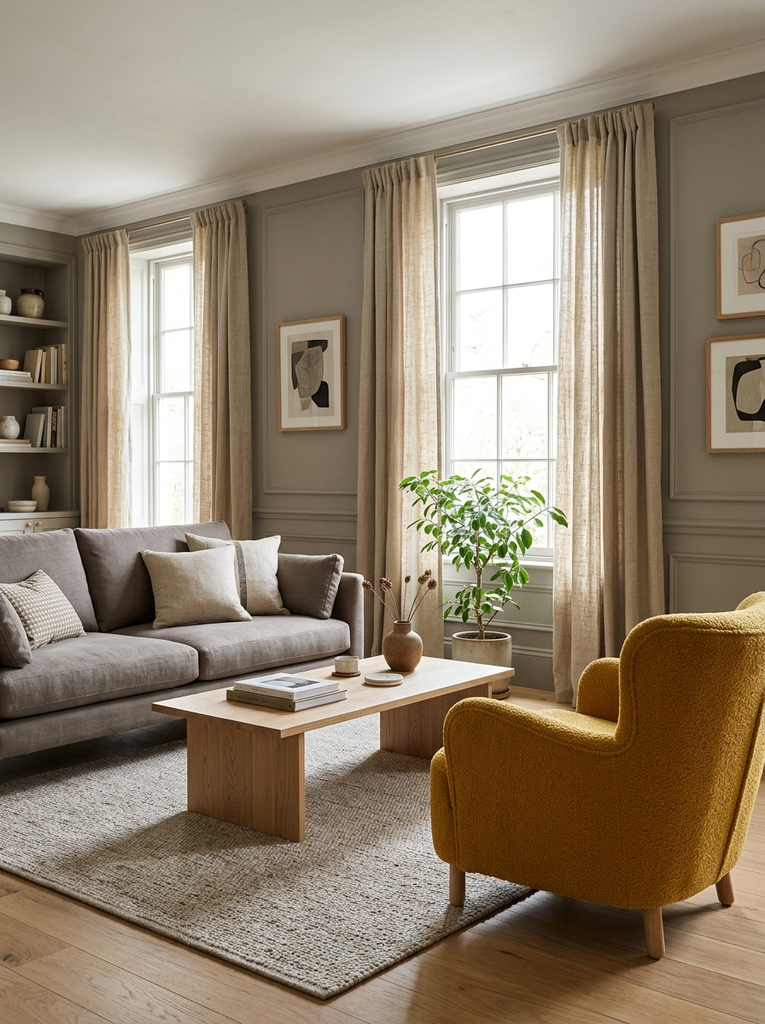
Mustard adds sunshine to a quiet room. Warm gray keeps the palette grounded, while natural linen softens everything. A single mustard armchair or a pair of pillows is enough to lift the whole space.
Rust, Caramel, and Soft White
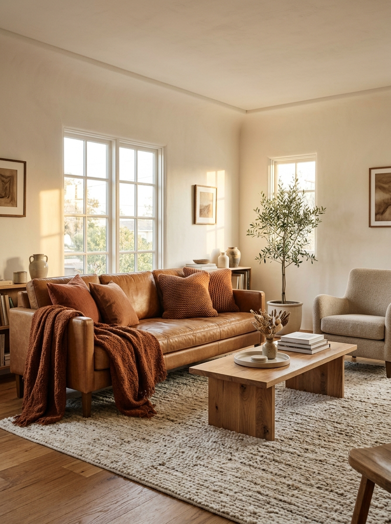
These shades all sit in the same warm family, so they blend together naturally. Soft white walls give the room a clean backdrop, while rust and caramel appear in leather, wood, and textiles. It is a great fall-inspired scheme you can enjoy year-round.
Colorful Living Room Color Schemes
If you want your living room to have real personality, these playful combinations are for you. The secret to making color work is to pair every bold shade with a calm neutral, so the eye has somewhere to rest.
Coral, Aqua, and Cream
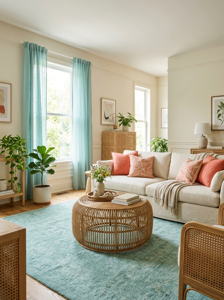
Coral and aqua are a cheerful, summery pair. Cream walls keep the mix bright rather than loud. Use coral on cushions or art and aqua on a rug or curtains for a lively, beachy feel.
Burgundy, Navy, and Antique White
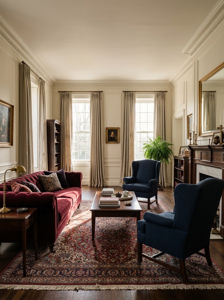
Burgundy and navy are both deep and rich, so together they feel formal and cozy. Antique white walls stop the room from feeling too dark. This is a good fit for traditional homes with wood furniture.
Dusty Pink, Sage Green, and Beige
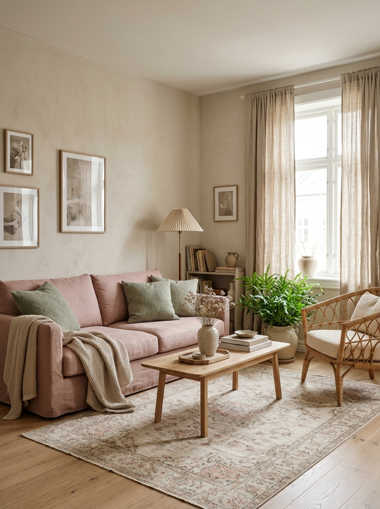
Dusty pink and sage green are soft and gentle, and beige acts as the quiet connector. The palette feels romantic without being sugary. It works especially well with rattan, linen, and light wood.
Mustard Yellow, Teal, and Warm White
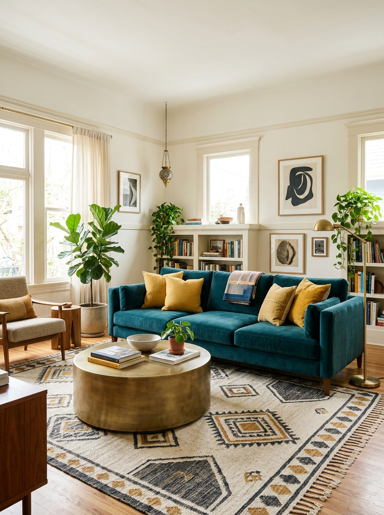
Yellow and teal are bold and a little retro, and warm white gives them space. Try a teal sofa with mustard pillows against warm white walls. It is a happy, high-energy scheme for people who love color.
Lavender, Peach, and Ivory
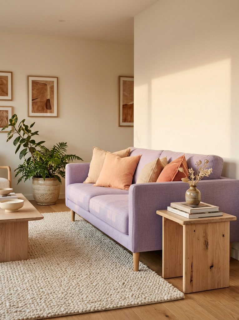
Lavender and peach glow together like a sunset. Ivory keeps the room from feeling too sweet, and a few cream textures help everything feel calm. It is a soft, creative scheme that suits a sunny room.
Light and Modern Living Room Color Schemes
Light, modern palettes rely on clean contrast and simple shapes. They suit smaller rooms, open layouts, and anyone who prefers a fresh, uncluttered look.
White, Black, and Natural Wood
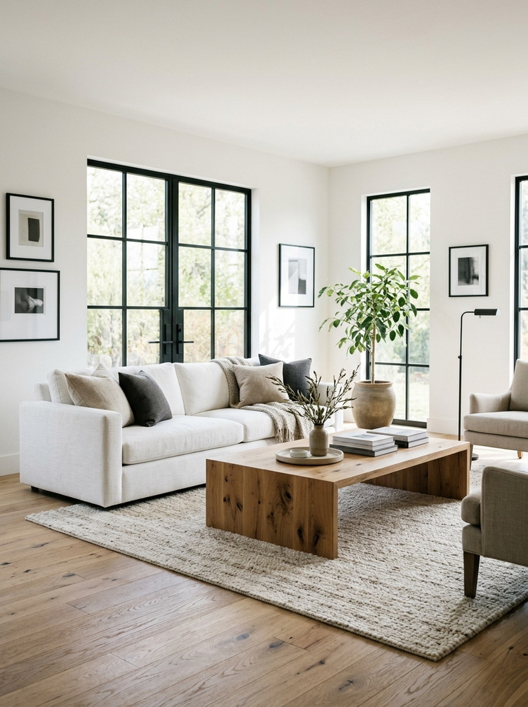
This high-contrast trio feels crisp and contemporary. White walls and a white sofa make the room bright, black frames or metal legs add definition, and natural wood warms everything up. Keep the accessories simple so the palette stays sharp.
Pale Gray, Soft Blue, and Cream
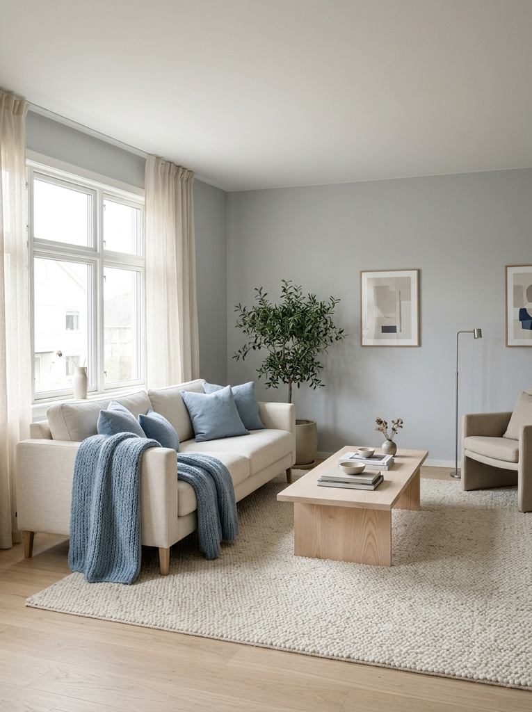
Pale gray gives a modern backdrop, soft blue adds a cool note, and cream stops the room from feeling chilly. It is a peaceful mix that works well in bedrooms-turned-lounges, apartments, and bright family rooms alike.
Blush Pink, White, and Light Gray
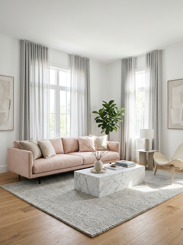
Blush pink adds a delicate warmth to a clean white and gray base. Use it in a sofa, a rug, or a pair of cushions. The overall effect is soft, stylish, and modern without being cold.
Sand, Pale Green, and Warm White
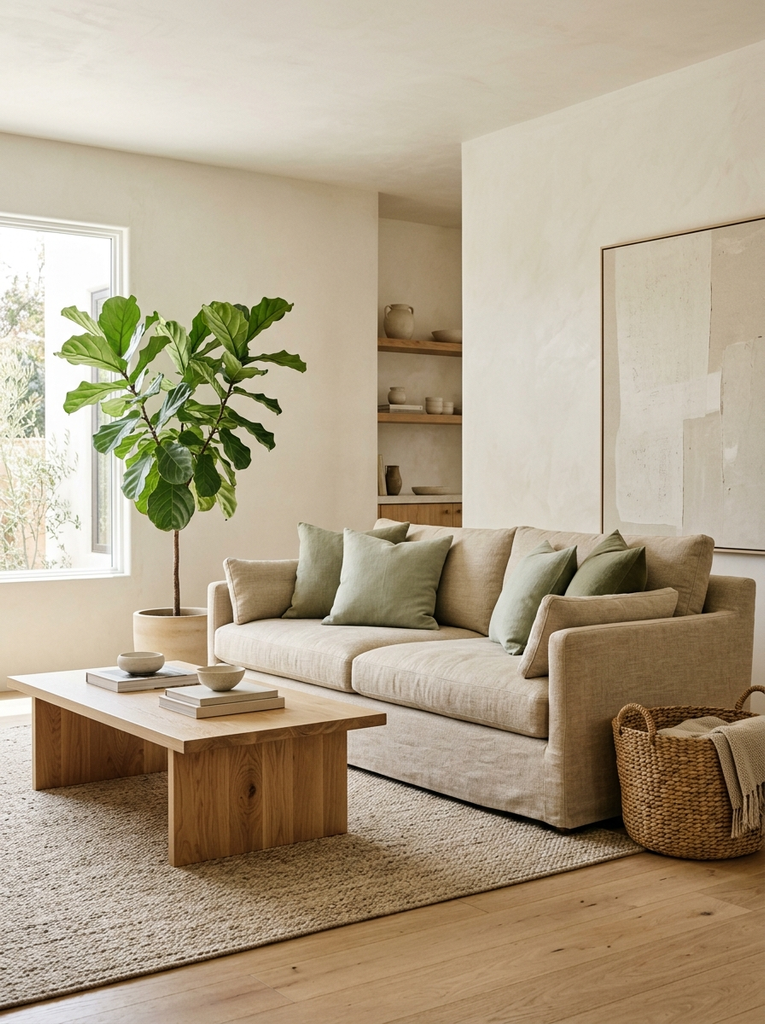
Sand and pale green are natural and calming, and warm white gives the room a gentle glow. Add plants, woven baskets, and light wood to lean into the organic mood.
Charcoal, Greige, and Soft White
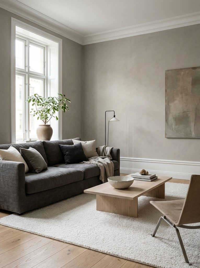
Charcoal anchors the room with a touch of drama, greige keeps it warm, and soft white lifts the whole scheme. A charcoal sofa with greige walls and white trim looks sophisticated and is easy to live with.
How to Use Living Room Color Schemes in Your Home
Once you have chosen a palette, the next step is putting it into practice. A few simple decisions about where each color goes will make the room look planned rather than accidental.
Choose the Right Wall and Furniture Colors
Walls should usually take the lightest or the calmest color in your palette, because they cover the largest area. Big furniture, such as the sofa, comes next. If you want to change your scheme later, a neutral sofa gives you the most flexibility, since you can alter the mood with cushions and throws.
Test your paint on a large board and look at it for a few days. Colors shift dramatically between morning and night, so a sample that seems perfect at noon might look very different under lamplight.
Add Color With Rugs, Curtains, and Accessories
Rugs, curtains, pillows, and art are the easiest ways to bring in accent shades. Use odd numbers, such as three pillows or five frames, and repeat each accent color at least twice around the room so it feels intentional. Plants and wood tones count as accents too, and they help bridge the gap between your colors and the rest of the space.
Frequently Asked Questions About Living Room Color Schemes
What is the best color combination for a living room?
There is no single best option, but warm neutrals such as cream, beige, and natural wood are a dependable choice because they suit almost every style and light condition. If you want more color, pair a soft green or dusty blue with those neutrals for a calm, welcoming look.
What colors make a living room look bigger?
Light, cool, and low-contrast colors make a room feel more spacious. Warm white, pale gray, soft blue, and pale green all reflect light and blur the edges of the walls. Painting the walls and trim in similar tones also helps the room feel open.
How many colors should a living room have?
Most designers suggest three to five colors, including neutrals. Choose one dominant color, one or two supporting shades, and a single accent. Wood tones and metal finishes count as part of the palette, so keep them in mind as you plan.
How do I choose a color scheme for my sofa?
Start with the sofa color you already own or love, then identify whether its undertone is warm or cool. Match your walls to that undertone, and use pillows, a rug, and curtains to bring in two supporting colors. A neutral sofa is the easiest to work with, while a colored sofa should be balanced by calm walls.
Final Thoughts on Living Room Color Schemes
The right living room color schemes make a space feel like yours. Start with the light in your room and the furniture you already own, then choose a palette that matches the mood you want, whether that is calm, cozy, bold, or bright. Keep the 60-30-10 rule in mind, test your samples at different times of day, and remember that you can always adjust the accents later. Pick the combination that makes you want to sit down, stay a while, and invite someone over.