
23 Beautiful Home Office Color Palette Ideas To Copy
Discover 23 beautiful home office color palette ideas, from sage and cream to navy and oak, plus easy tips to pick the right colors for your space.
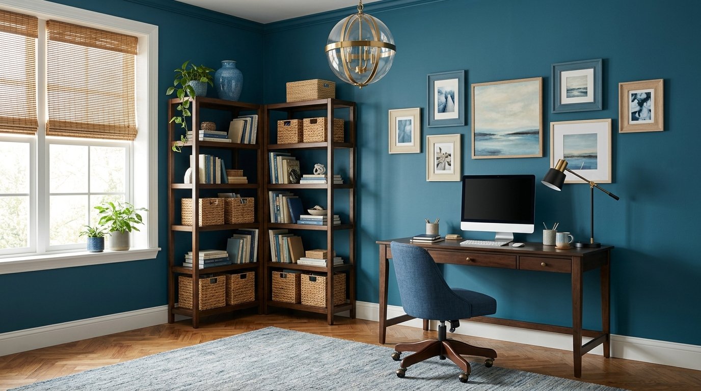
The right home office color palette ideas can change how a workspace feels before you move a single piece of furniture. Color sets the mood the moment you sit down soft, earthy tones invite you to settle in, deep shades build focus, and light neutrals keep a small room open and organized. It also ties your desk, chair, shelves, and decor into one look that feels deliberate rather than thrown together.
Choosing a palette can feel overwhelming, though, especially when every paint chip starts to look the same. That is why this guide breaks it down into 23 ready to use color combinations, each one paired with the materials and accents that make it work. You will find calming neutrals, bold jewel tones, cozy earth shades, and fresh pastels, so there is a match for every personality and every size of room. Browse through, save the combinations that speak to you, and use the tips near the end to pick the one that suits your light and your furniture.
23 Home Office Color Palette Ideas for Every Style
1. Warm Beige and Natural Wood Home Office Color Palette
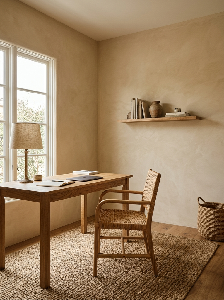
If you want a workspace that feels welcoming from the first minute, warm beige and natural wood is a dependable place to start. Paint the walls a soft, sandy beige and let a wood desk, shelves, or picture frames bring in the warmth. The two tones sit close together on the color wheel, so nothing competes for attention and the room stays easy on the eyes during long days. Add texture rather than more color a woven basket, a linen lamp shade, or a wool rug. This combination suits almost any taste, and it pairs especially well with the calm, natural look of a home office aesthetic built around simple materials.
2. Sage Green and Cream Home Office Color Palette
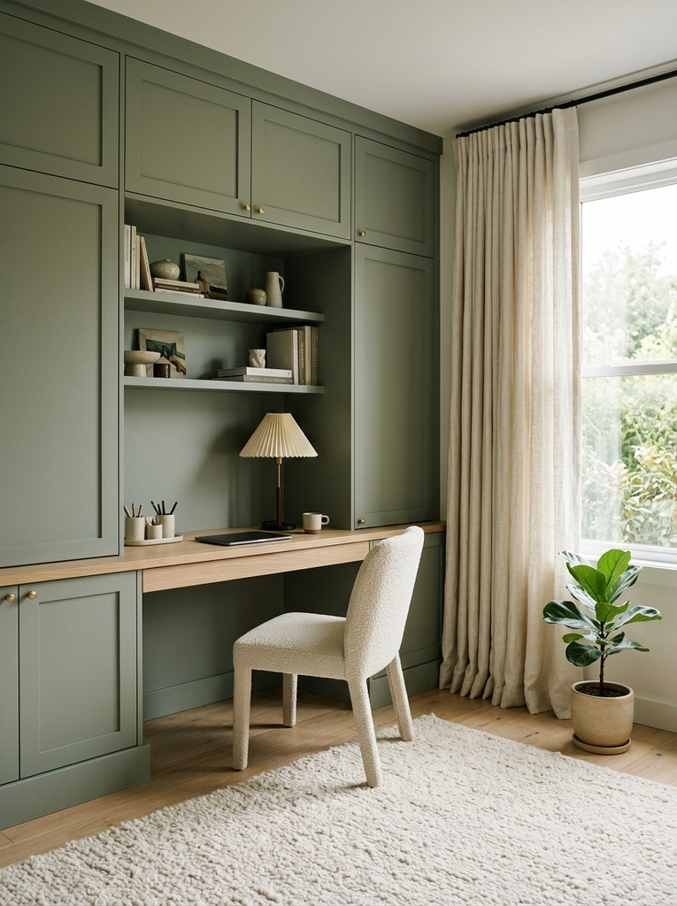
Sage green brings the quiet of a garden indoors, and cream keeps it from feeling heavy. Use sage on the walls or on built in cabinetry, then bring in cream through curtains, a desk chair, or a thick area rug. The soft gray undertone in sage makes it a gentle backdrop for screen work, while cream adds a glow that reads warm in the evening. Finish with a small potted plant and a ceramic desk organizer for a touch of life. It is a lovely option for anyone who wants a calm room that still has some personality.
3. Navy Blue and Warm Oak Home Office Color Palette
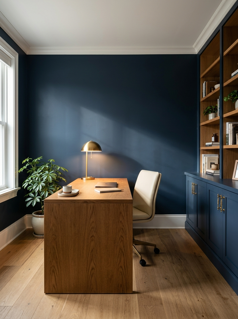
Navy and oak is a classic pairing that feels polished without being stiff. Deep blue on an accent wall or lower cabinets creates a focused, professional backdrop, while warm oak flooring or a wood desk keeps the room from turning cold. Choose a matte finish on the navy to cut glare and make the color look richer. White trim, a cream shade, or brass hardware can brighten the mix. This palette works well in rooms with plenty of daylight, where the dark blue looks inky and sophisticated instead of heavy.
4. Soft Gray and White Home Office Color Palette
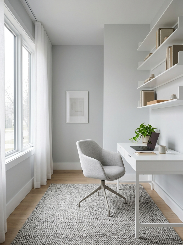
For a clean, modern workspace, soft gray and white is hard to beat. Light gray walls, a white desk, and crisp white shelving create an airy backdrop that makes a room feel larger and keeps visual clutter low. To stop the look from feeling flat, vary the shades of gray across textiles and metal accents, and add one natural element such as a wood tray or a green plant. A warm gray with a hint of beige is usually more inviting than a blue-toned one, especially in rooms that do not get much sunlight.
5. Terracotta and Sand Home Office Color Palette
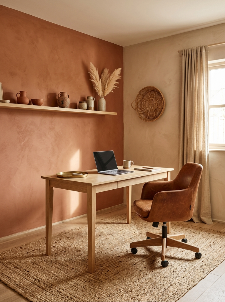
Terracotta and sand bring a sun baked, desert warmth to a home office. Try a terracotta accent wall behind the desk, or use the color in a rug, pottery, or a leather chair, and let sandy walls and curtains soften the effect. Because terracotta is rich and energetic, it works best when balanced by plenty of lighter neutrals. Add rattan, dried grasses, or a jute rug to lean into the earthy mood. This palette is a wonderful choice if you want your workspace to feel creative, lived-in, and far from corporate.
6. Emerald Green and Brass Home Office Color Palette
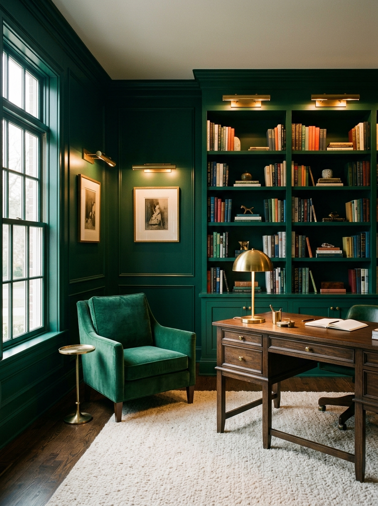
Emerald green and brass is the combination to choose when you want your office to feel a little luxurious. Paint the walls or a bookcase in a deep emerald, then add brass through a desk lamp, picture lights, drawer pulls, and a slim frame or two. The metallic glow bounces light around the room and keeps the dark green from swallowing it all. A velvet chair or a cream rug adds softness. Because the look is bold, it suits a study or a dedicated room best, and it looks especially striking in the evening under warm bulbs.
7. Dusty Blue and Warm White Home Office Color Palette
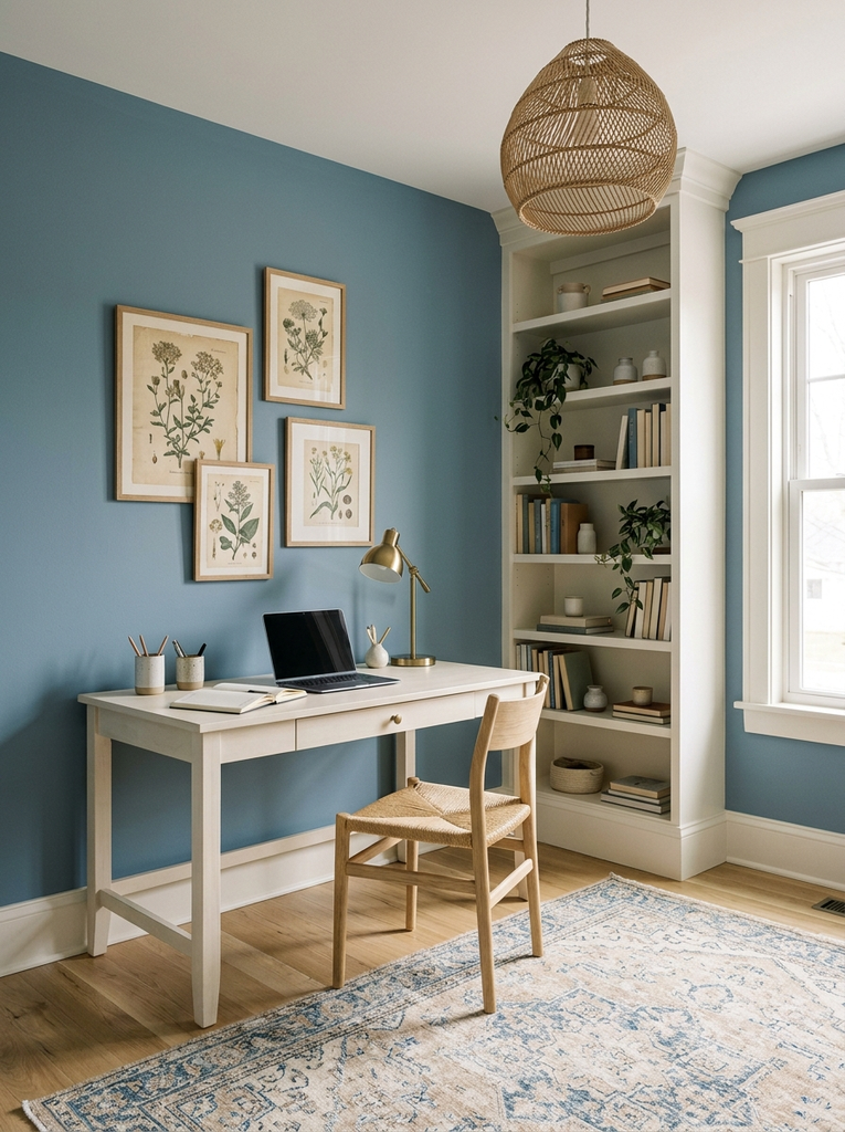
Dusty blue has a faded, slightly gray quality that feels relaxed rather than corporate, and warm white keeps it light. Cover the walls in dusty blue and use warm white on trim, shelving, and the desk to create a soft, layered look. Cool blues are widely associated with a calm mood, so this is a good fit if your work involves long stretches of concentration. Brighten it with a woven shade, pale wood accents, or a vintage style rug. This pairing is gentle, timeless, and easy to live with for years.
8. Charcoal and Blush Home Office Color Palette
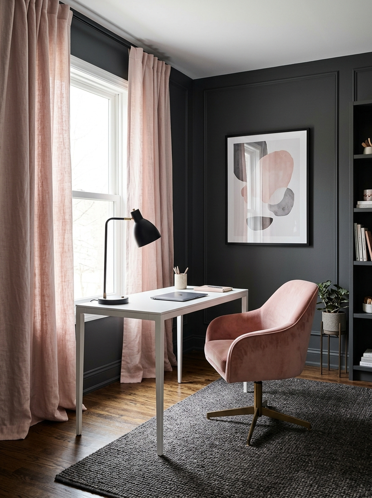
Charcoal and blush may sound like an unlikely match, but the contrast is exactly what makes it work. The deep gray adds depth and a professional edge, while blush softens it with warmth and a hint of romance. Paint the walls charcoal and bring in blush through a chair, curtains, or art, or reverse the roles with blush walls and charcoal furniture. Keep metals simple, such as matte black or soft gold. It is a flattering palette for creative workspaces where you want drama and softness in the same room.
9. Cream and Light Oak Home Office Color Palette
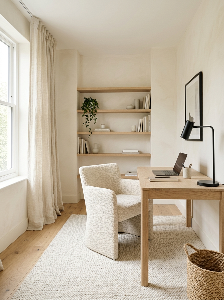
Cream and light oak creates a bright, Scandinavian leaning workspace that feels fresh all year. Creamy walls reflect daylight beautifully, and light oak adds a gentle warmth through the desk, flooring, or shelving. Since both shades are quiet, you can layer in texture freely: bouclé, linen, wool, and woven fibers all look at home. A black picture frame or a slim black lamp gives the room a little definition so it does not blur together. It is a smart palette for small rooms, because the light tones keep things open and uncluttered.
10. Olive Green and Natural Wood Home Office Color Palette
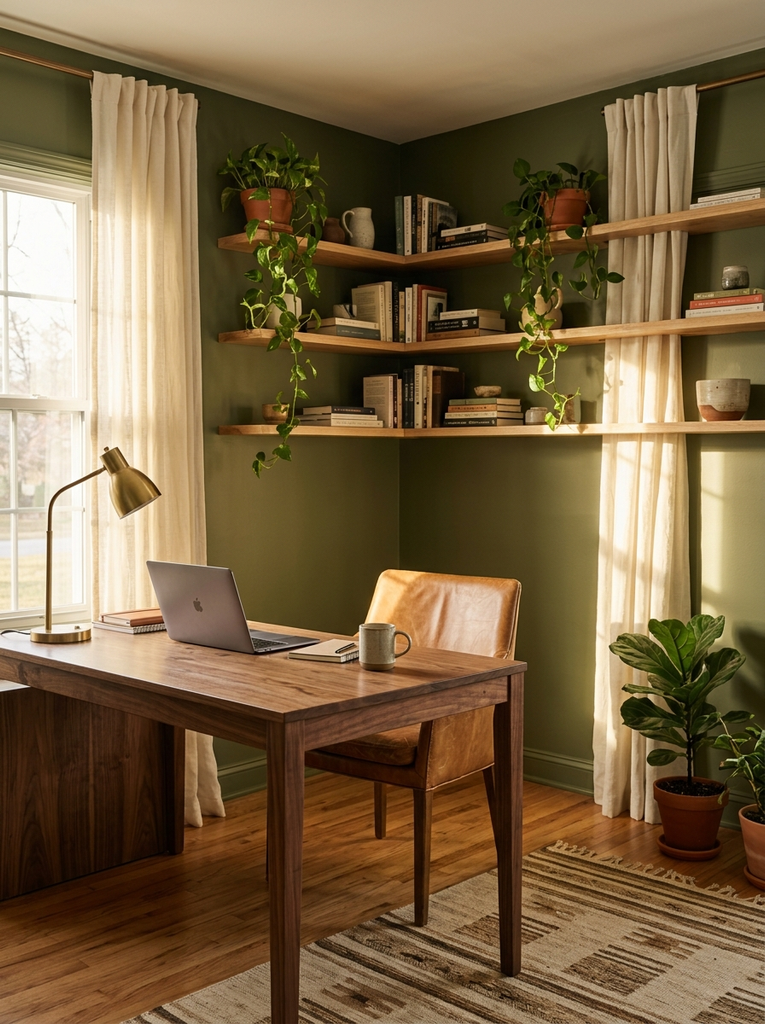
Olive green carries more earth and warmth than brighter greens, which makes it a natural partner for wood. Try olive on the walls with a walnut or oak desk, or paint built ins in olive and keep the walls a soft off white. The color feels grounded and settled, a good setting for steady, thoughtful work. Add leather, linen, and a few terracotta pots to strengthen the organic mood. If your room gets limited daylight, choose a lighter, slightly yellowed olive so the space does not feel closed in.
11. Lavender and Soft Beige Home Office Color Palette
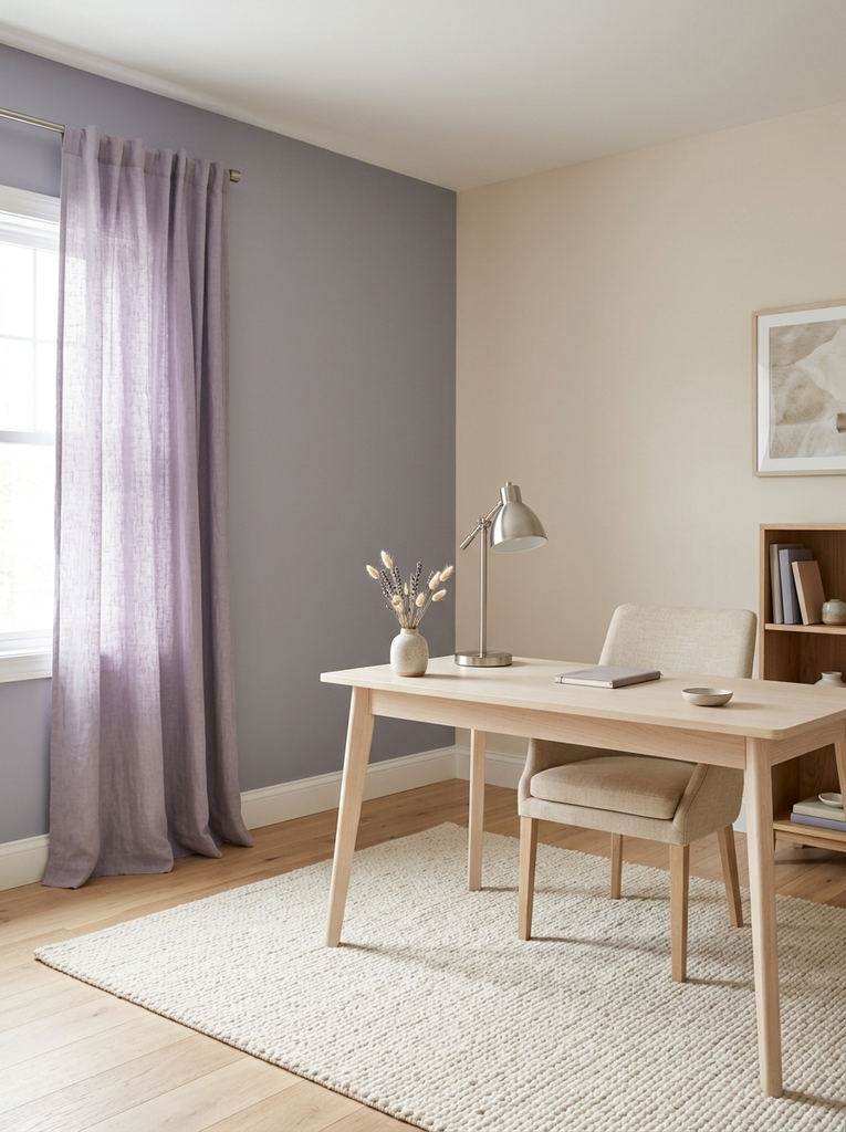
Lavender and soft beige offers a gentle, restful alternative to the usual blues and grays. The pale purple adds a hint of color and creativity, while the beige grounds it and keeps the mood warm. Use lavender on one wall or through textiles such as curtains and a throw, and let beige handle the rest. Choose a gray leaning lavender instead of a bright one for a more grown-up look. Pale wood, a cream rug, and brushed nickel accents finish the room. It is a lovely palette for anyone who wants softness without going fully pink.
12. Black and White Home Office Color Palette
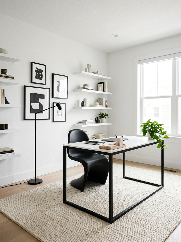
A black and white home office is crisp, graphic, and endlessly flexible. White walls and shelves keep the room bright, while black appears in the desk legs, picture frames, lighting, and chair for strong contrast. The key is balance too much black can feel heavy, so aim for roughly a quarter of the room in dark tones. Add a wood tray, a green plant, or a warm rug so the scheme does not feel cold. This palette looks sharp in modern spaces and makes it easy to change accent colors whenever you feel like it.
13. Mocha Brown and Cream Home Office Color Palette
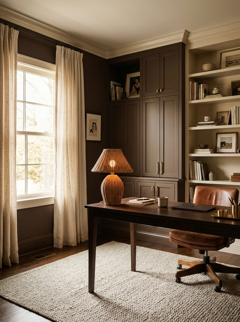
Mocha brown and cream feels like a cozy coffeehouse, and it makes a home office feel warm and settled. A deep mocha on the walls, cabinets, or a leather chair pairs beautifully with cream curtains, cream shelving, and light rugs. Brown is a rich neutral, so it supports a wide range of materials, from rattan to brushed brass. Keep lighting warm to bring out the chocolate tones, and add layered textiles for comfort. This palette is a good fit for traditional, rustic, and modern organic spaces alike.
14. Teal and Mid Century Wood Home Office Color Palette
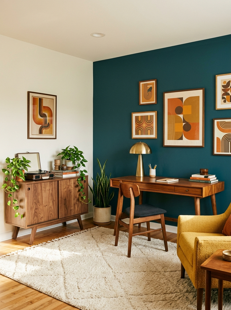
Teal and mid century wood is a fun, retro inspired pairing with plenty of personality. The blue green shade looks vibrant against the warm, reddish tones of teak or walnut, and it suits furniture with tapered legs and clean lines. Use teal on an accent wall or a single statement piece, such as a credenza or armchair, rather than everywhere. Add mustard or cream accents for extra energy, and keep the rest of the room fairly simple so the colors stay the stars. It is perfect for creative professionals who like their workspace to feel lively.
15. Pale Blue and White Coastal Home Office Color Palette
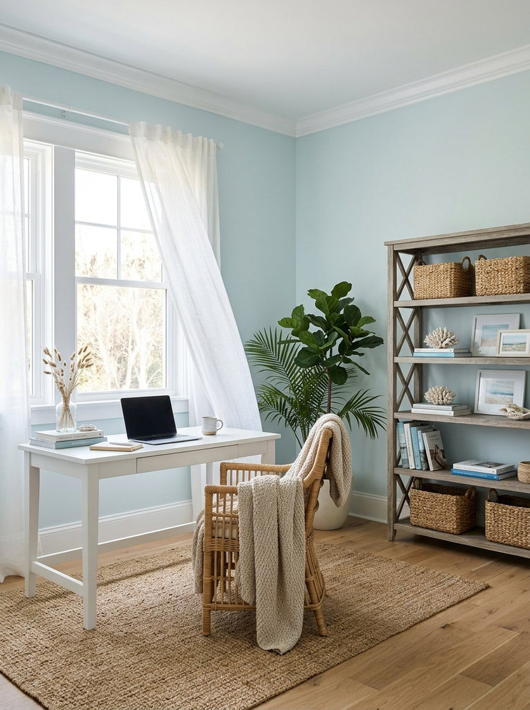
Pale blue and white bring an easy, breezy coastal feeling to your workspace, even if the closest water is the kitchen faucet. Soft blue walls with white trim and a white desk keep the room light and airy, while natural fibers such as rattan, jute, and seagrass add a relaxed texture. A bit of driftwood toned wood or sandy beige prevents the look from turning too cool. The colors reflect light well, so they work nicely in small or north facing rooms. It is a refreshing choice if you want your office to feel calm and open.
16. Muted Peach and Warm Gray Home Office Color Palette
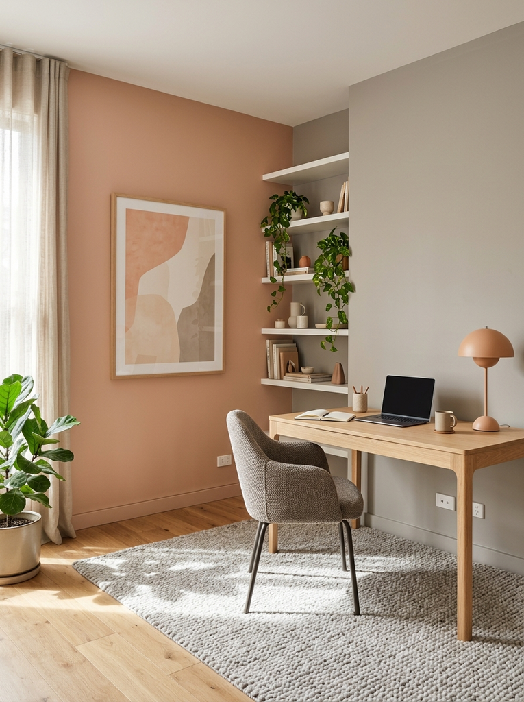
Muted peach and warm gray is a modern, soft combination that feels friendly and current. Peach adds a gentle blush of warmth, while warm gray steadies it and stops it from looking sugary. Try a peach accent wall with gray furniture, or keep the walls gray and bring peach in through a chair, a lamp, or artwork. Choose a dusty, desaturated peach rather than a bright coral for a more sophisticated result. White shelving and light wood keep the whole thing fresh. It is an uplifting palette for mornings when you need a little extra energy.
17. Forest Green and Walnut Home Office Color Palette
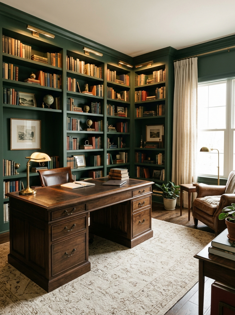
Forest green and walnut deliver a rich, library like atmosphere that feels established and calm. Deep green on the walls or cabinetry makes a dramatic backdrop for a dark wood desk and warm lighting, creating a cocoon that is perfect for focused work. Balance the darkness with a lighter rug, cream accents, and plenty of lamps at different heights. Brass or aged bronze hardware ties the scheme together. Because this palette is bold, it shines in a dedicated room, though a single green wall behind a walnut desk can work in smaller spaces too.
18. Mustard Yellow and Warm Beige Home Office Color Palette
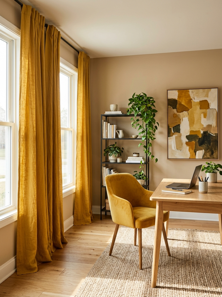
Mustard yellow and warm beige bring sunshine into your workspace without the harshness of a bright yellow. The earthy, slightly golden tone feels cheerful and creative, and beige keeps it grounded and soft. Use mustard in small doses through a chair, curtains, pillows, or a statement art piece, and let beige cover the walls and larger surfaces. Natural wood, black metal, and a few green plants round out the look. It is an energizing palette for a space where you brainstorm, design, or write, particularly in rooms that could use a lift.
19. Greige and Matte Black Home Office Color Palette
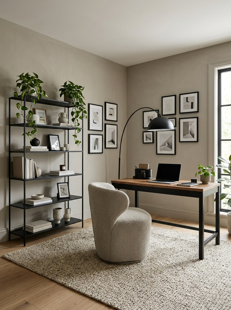
Greige, the blend of gray and beige, is one of the most versatile wall colors, and pairing it with matte black gives it a modern edge. Paint the walls a warm greige, then add black in the form of metal shelving, a desk frame, a floor lamp, and picture frames. The contrast keeps the room from looking flat, while the neutral background makes it easy to change decor with the seasons. Add wood tones and textured fabrics for warmth. It is a safe yet stylish palette that works in nearly any home.
20. Mint Green and Light Wood Home Office Color Palette
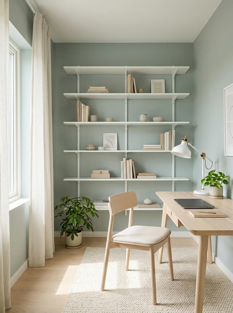
Mint green and light wood is a fresh, youthful pairing that makes a small office feel bright and cheerful. Keep the mint soft and slightly gray so it reads as calm rather than candy like, then pair it with birch, ash, or pale oak for a clean Scandinavian feel. White shelves and a few brass or white accessories keep the look crisp. This combination is especially nice in rooms with good daylight, where the green looks clean and lively. It is also a smart choice for shared spaces and hobby rooms that double as an office.
21. Burgundy and Cream Home Office Color Palette
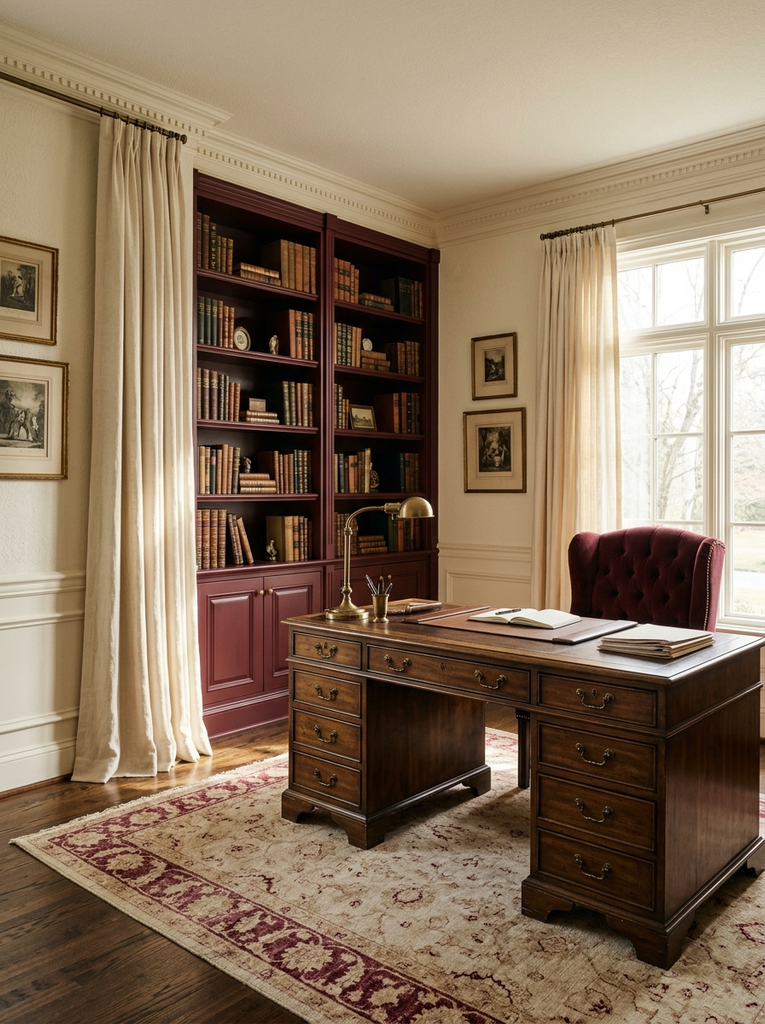
Burgundy and cream offers old world elegance with a warm, cozy feeling. Deep wine tones look wonderful on a feature wall, an upholstered chair, or a rug, and cream softens the overall effect on walls and curtains. Pair them with dark wood and antique brass to create a study that feels traditional and refined. Because burgundy is dramatic, use it with intention: one or two strong pieces are usually enough. It is a great choice for people who love classic libraries, vintage furniture, and a workspace with plenty of character.
22. Soft Pink and Sage Home Office Color Palette
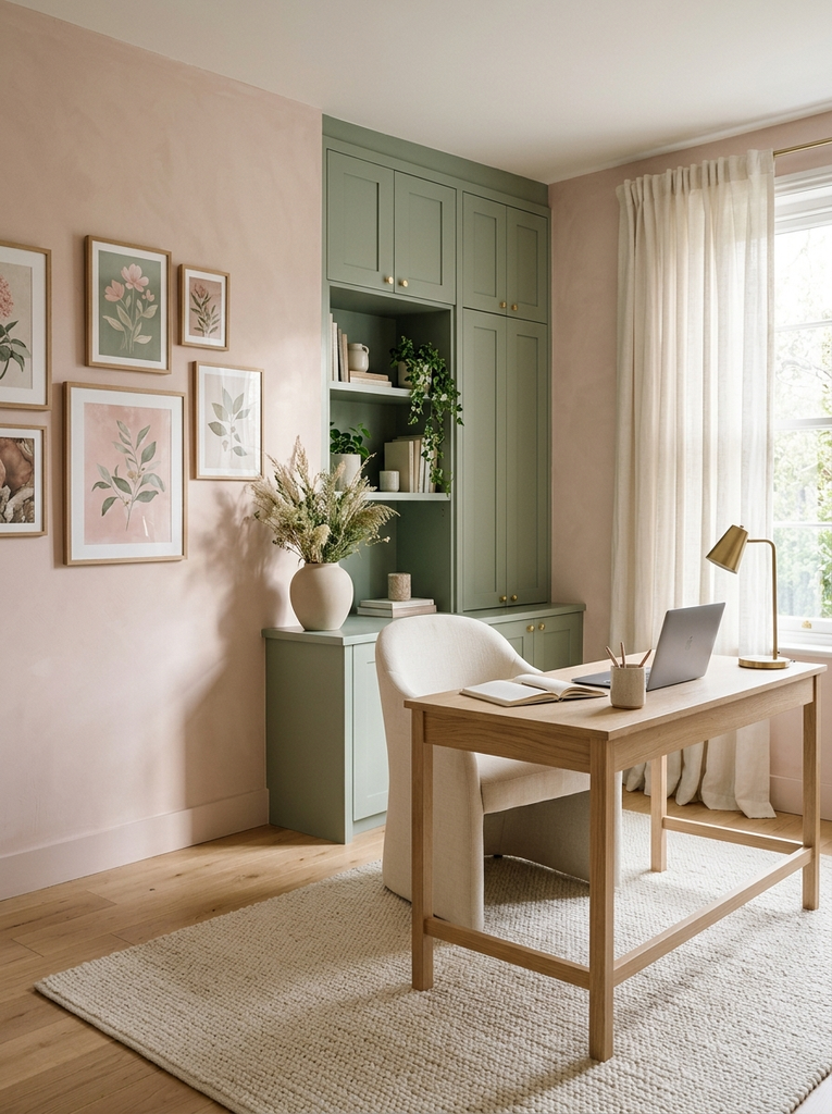
Soft pink and sage is a gentle, garden inspired pairing that feels creative and calm at once. Pale pink walls with sage cabinets or accessories give the room a soft glow, and the two colors share a similar muted quality, so they blend easily. Add cream, light wood, and a touch of gold to keep it grown up and avoid anything too sweet. This palette is lovely for creative businesses, studios, and anyone who wants a workspace that feels fresh and personal while still being practical for a full day of work.
23. Deep Blue and Warm Neutral Home Office Color Palette
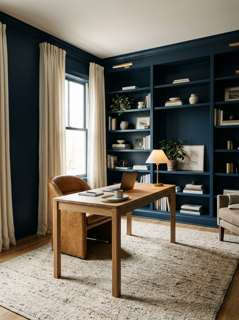
Deep blue and warm neutrals make a balanced, sophisticated scheme that brings out the best in both. A rich midnight or cobalt shade on the walls or built-ins feels refined, and neutrals such as camel, sand, and cream stop it from feeling cold. Layer leather, wool, and wood for texture, and use soft lighting to bring out the depth of the color. It is similar to navy and oak but leans more neutral, which makes it easier to pair with the furniture you already own. It is a polished, lasting choice for a professional home office.
How to Choose the Best Home Office Color Palette Ideas for Your Space
With 23 options on the table, the final decision comes down to your room, your furniture, and the way you work. A few practical checks will help you narrow the list quickly and avoid repainting later.
Consider Your Room’s Natural Light
Light changes color more than almost anything else. A room that faces south or west gets warm, golden light, which makes cool blues and grays look softer and deep colors look rich. A room that faces north tends to look cooler and dimmer, so warm neutrals, creams, and earthy shades keep it from feeling chilly. Watch the room at different times of day before you commit, because a color that looks perfect at noon can turn muddy at dusk.
Choose Colors That Complement Your Existing Desk and Furniture
Your desk, chair, and shelving are already part of the palette, so work with them rather than against them. Look at the undertone of your wood honey and oak lean yellow, walnut leans brown, and cherry leans red. Warm undertones love creams, beiges, and greens, while cooler finishes look good with grays and blues. Hold a paint sample right next to your desk and chair, since that comparison tells you more than any photo can.
Use Lighter Shades in Small or Dim Workspaces
Pale colors reflect more light, which makes tight rooms feel larger and calmer. If you are working with a compact room, soft palettes like cream and light oak, pale blue and white, or mint and light wood are a safe bet. Our guide to tiny house office ideas shows how a few smart choices make even a small corner productive, and the guest room office combo ideas are helpful when one room has to do two jobs. You can still add depth with darker accessories without closing the room in.
Test Paint Samples Before Committing to a Color
Never choose a wall color from a tiny chip. Paint a large swatch, roughly two feet square, on at least two walls, or use peel and stick samples you can move around. Check them in the morning, afternoon, and evening, with your lamps both on and off. Give it a day or two, because first impressions can change. If you want to see how designers approach the same decision, this roundup of home office paint color ideas is a useful source of extra inspiration before you buy a gallon.
Frequently Asked Questions About Home Office Color Palette Ideas
What is the best color palette for a home office?
There is no single best option, but calm, balanced palettes tend to work well for most people. Soft greens, muted blues, warm neutrals, and wood tones support long stretches of focus without feeling dull. If you want to stay safe, start with sage and cream, warm beige and wood, or soft gray and white. If you are more adventurous, choose one bold color for a single wall or a statement piece and keep everything else neutral.
Which home office colors work best in a small room?
Light, soft colors work best in a small room because they bounce light around and make walls feel farther away. Cream, pale blue, mint, soft gray, and warm white are all strong choices. Keep the walls, trim, and large furniture within the same light family, then add personality through accessories such as art, lamps, and textiles. If you love dark colors, limit them to one wall or to cabinetry so the room does not feel closed in.
How many colors should a home office palette include?
Three to four colors is a good target. A simple approach is to use one main shade for the walls, a second for large pieces like the desk or shelves, and one or two accent colors in small doses. Wood tones and metal finishes count as part of the mix, so keep them in mind too. Sticking to a limited palette keeps the room calm, and it makes your workspace look planned instead of cluttered.
Final Thoughts on Home Office Color Palette Ideas
A good palette does more than make a room pretty. It shapes your mood, supports your focus, and turns an ordinary corner into a place you actually want to sit down in each morning. Whether you choose a quiet combination like cream and light oak or a bold one like emerald and brass, the best home office color palette ideas are the ones that suit your light, your furniture, and your personality.
Take your time, test your samples, and trust your instincts. Save your favorite color combinations to a board so you can compare them side by side, and use them as a guide the next time you refresh your home office. A few thoughtful color choices can change the whole feeling of your workday.